Sunday 24 March 2013

Module 2, Chapter 5: Patterned papers

To create my first batch of patterned papers I applied black ink onto white paper using a variety of home made 'tools'. These tools were made from a variety of materials ranging from card implements bent and cut into a variety of forms, an old screw and an odd piece of neoprene! The image below shows a selection of what I created, however please note these are just off-cuts and I actually created a wider range of larger papers for use in other chapters later on.


Patterned papers using ink
2/5/1: Patterned papers using ink
My next batch of patterned papers were all created using various monoprinting techniques. Some were monoprints taken from patterned surfaces, others off surfaced that had been scribed with pattern using a variety of home made tools like before. I tried black printing onto white papers and vice versa. Once again the results below only represent a small selection of what I created, the bigger (and admittedly more successful!) pieces were used in later paper collages. Note the attempts at monoprinting off bubble wrap...inspired by my observations in chapter 4.

Patterned papers using monoprinting
2/5/2: Patterned papers using monoprinting
 The final image shows further patterned paper samples where I experimented with other printing techniques. I printed using the tools from the ink papers, the rim of an old lid, a rough old paintbrush, a sponge and also using the printing stamp I created in my module one project. I found this stamp was perfect as it was so similar in shape to the scales on the snakes skin. Again I experiemented with black on white versus white on black. Also in the image below at the top of the first page are my *failed* bleach samples. I do not think these failed because of the inks/papers I used (which I know should have worked as I have seen them work for my own students), but failed because the bleach was VERY old (dated back to the 90s!!!!). I was also reluctant to try any further bleach samples (or to buy some new bleach) as the mere whiff of it sets of migraines for me and the only way to ventilate was to have all the doors and windows in the house open. This was not practical considering the temperature outside at the time was colder than 0 degrees. As with all the previous patterned papers these are a small sample of what I actually created for future use later on in the project.


Other patterned papers
2/5/3: Other patterned papers


Module 2, Chapter 4: linear drawings from research

The following images show my drawings against backgrounds of images taken from my own photos and moodboards created in the module introduction. I have also included on each page some Photoshop work which has taken aspects of the background image with filters applied so that they become more like drawings. This chapter links well to the drawings I previously produced in the introduction. The lizard skin page below really reminds me of bubble wrap... something to exploit later on!


Linear drawings from research, pages 1 & 2
2/4/1: Linear drawings from research, pages 1 & 2

 Linear drawings from research, pages 3 & 4
2/4/2: Linear drawings from research, pages 3 & 4


Module 2, Chapter 3: Tonal effects in machine stitchery

I am lucky enough to have a sewing machine which has a wide variety of stitch options, plus the ability to do CAD/CAM embroidery. The following images show all my experiments for this chapter. My page annotations log the stitch settings for each sample. The final samples shown were specific experiments to try and give the essence of some of the animal markings that I had been looking at for inspiration.

I really liked the use of a thicker thread in the bobbin and sewing the sample upside down. I felt the textured effects this gave were interesting- especially with the contrasting top thread colour. On the downside however I was always winding bobbin thread as it ran out very quickly and had to un-jam my machine constantly. As a result I will think twice about using this thicker thread effect later on even though I love the texture.... however I do still like the idea of using contrasting top and bobbin threads.


Machine Stitchery 1
2/3/1: Machine Stitchery 1

Machine Stitchery 2
2/3/2: Machine Stitchery 2


Module 2, Chapter 2: Tonal columns in stitchery

To start this chapter I created a tonal column using stitchery in black and white threads. The way in which I overlapped and blended the threads in the middle sections was responsible for the overall effect. I was happy with this sample, however it took me quite a long time to create as I was a perfectionist in how and where the threads needed to be placed!

Following on from the tonal sample I used graph paper to plot out potential ideas for a blackwork tonal column. I tried 4 variations on paper before committing to stitching my 4th effort. The point of each of these designs was to add an additional stitch to the pattern as the pattern progressed down the column. I did this to each row, however I could have alternatively stitched for a few rows before adding the next stitch addition for a larger sample.

The next blackwork sample I produced used spacing of stitches to create a tonal effect. Once again, if I was to rework this sample on a larger scale, I would stitch several rows the same before adding more space between each row of the pattern.

Finally, my last sample for this chapter I used the thickness of the thread to create the tonal effect. I started with a doubled up yarn, progressed to embroidery threads removing a strand every few rows. The final few rows I used the finest cotton thread I could find which happened to be marginally thinner than a single embroidery thread strand. Out of all my samples I feel that this is the best tonal effect overall.

Please see the image below that displays all the samples I have blogged about:


Tonal columns in stitchery
2/2/1: Tonal columns in stitchery


Module 2, Chapter 1: The study of tone

This chapter is all about tone- the transitioning from dark shades to light. The first image shows my first attempts at tonal columns using a black fineliner pen. For the second and third columns I was taking particular inspiration from my reptile research.


Black pen tonal columns
2/1/1: Black pen tonal columns
 Progressing on from the black pen, I tried a variety of mediums from white pen, paint and collage to see if I could create further tonal effects. The columns I created are in the image below. Note the second column on the right hand page- the flash from the camera gave an uneven effect in the photo and in reality all the dark 'blobs' are actually jet black.


Tonal columns using different mediums
2/1/2: Tonal columns using different mediums
 As I had been previously experimenting with mark making using Photoshop, I thought this would be an appropriate opportunity to continue these ideas but into my tonal columns. The following images show the results of these where I have used different brushes and filters for the mark making techniques and the spacing of marks / light and dark layers for the tonal effects.


Photoshop tonal columns sheet 1
2/1/3: Photoshop tonal columns sheet 1

Photoshop tonal columns sheet 2
2/1/4 Photoshop tonal columns sheet 2
 
Photoshop tonal columns sheet 3
2/1/5 Photoshop tonal columns sheet 3

Photoshop tonal columns sheet 4
2/1/6 Photoshop tonal columns sheet 4


Module 2 'Animal markings' Introduction

To help gather my initial thoughts for this module I produced 'word clouds' on the first two creatures that came to mind: cats and snakes. These word clouds are shown below. I found this to be a useful exercise as it made me consider a wide range of aspects of these animals such as feelings and textures rather than just the obvious visual patterns from their markings.


wordclouds
2/intro/1: Word clouds to help focus ideas
 Following on from these initial thoughts I created 3 moodboards using pictures I found from searching on Google images. The first of these looked at wild cat markings (such as tigers and leopards), the second a range of animals (such as giraffes, zebras and dogs) and finally the third a range of snake/reptile markings. From each moodboard I sketched a page of marking that caught my eye. This was a very helpful exercise for later on in the project when I needed to replicate these marks through printing etc. This work also compliments the work produced in chapter 4. The moodboards and sketches are displayed below:


Moodboard 1
2/intro/2: Moodboard 1

Sketches from moodboard 1
2/intro/3: Sketches from moodboard 1

Moodboard 2
2/intro/4: Moodboard 2

Sketches from moodboard 2
2/intro/5: Sketches from moodboard 2

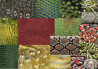
2/intro/6: Moodboard 3

Sketches from moodboard 3
2/intro/7: Sketches from moodboard 3

Working in a school, I am very lucky that I have access to resources that most people would not be able to see. One such resource proved very helpful with this research for this project. In one of the school's science labs there are several reptile and snake tanks. I was able to hold the snakes and gain a first hand appreciation of their beautiful skin textures and markings. I took a range of photos of the creatures which I have collaged together into my sketchbook (see below image). I specifically used these photos in chapter 4 to inspire further sketches of markings. The second picture below shows one of my favourite photographs of 'Ziggy the snake' closer up. I particularly like these markings as there are two 'layers': The first is the darker pattern on the skin contrasting with the paler background. The second is the pattern of the scales themselves and the way in which the shadows between each one create their own distinct shapes.


My own photos of reptiles and snakes
2/intro/8: My own photos of reptiles and snakes

Photo of Ziggy the snake
2/intro/9: Photograph of 'Ziggy the snake'
 After being particulary inspired by the reptiles and snakes I decided to create a page of typography that highlighted all the words that came to my mind while studying these creatures. The idea was to make the word so that the word appeared visually to represent its meaning. See image below for this.


Typography
2/intro/10: Typography
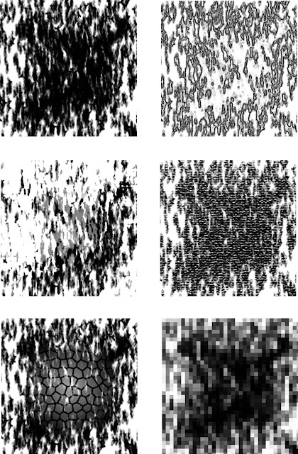
For the next stages of my research I turned to Photoshop for mark making activities. Using this computer programme's brushes and filters I tried to replicate some of the patterns and textures from both my moodboards and own photos. The following images show the results of these experiements. Some attempts were more successful than others and the better ones helped me later on in the project when printing my own papers and fabrics. 

2/intro/11: Mark making sheet 1

Mark making sheet 2
2/intro/12: Mark making sheet 2

Mark making sheet 3
2/intro/13: Mark making sheet 3

Mark making sheet 4
2/intro/14: Mark making sheet 4

Mark making sheet 5
2/intro/15: Mark making sheet 5
To finish off my research (introduction) section for this module I produced a page of experiments with mark making using a wide variety of mediums. The marks were drawn/scribbled, rubbed, dabbed, rubbed, collaged and I used both black and white mediums for different effects. The resulting page is shown in the below image.


Manual mark making
2/intro/16: Manual mark making


Back to blogging

Although I have been working on module 2 since October 2012, I have not yet blogged anything! I intend to start blogging from today as I am very nearly at the point of needing to start my final piece.

The last few months have been a real challenge for me to keep going with my module. I have had health issues that stopped me working for about two months which have delayed things somewhat. I am also working in a school that has recently gone into 'special measures' and as a result it is rare I get home before 7pm these days and even rarer I reach home not totally and utterly exhausted! Fingers crossed things will start to look up after Easter ;)

Enough about me though, better get on with the much overdue blogging...