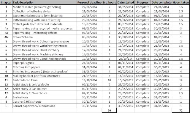
Costs:
Schedule:
Sunday, 31 May 2015
Module 4, chapter 11: Final piece and evaluations
Evaluation:
How do you feel about the resulting conclusion?
Overall I am very pleased with what I have made as I feel that it is a good composite of my favourite samples and it really challenged me in the making- there were many times I was out of my comfort zone but these pushed me to create a unique piece that held onto the essence of my original ideas but had shown development along the way. I am particularly happy that I made the point of moving away from more predictable shapes and styles for the book type structure. From the very beginning I had thought about making a more traditional folder. As I was modelling out potential ideas in chapter 10 however I reflected on the shapes that stood out as more interesting. All of these were non conventional in terms of what you would expect from a book. I looked back at my initial research- notably the photographs I had taken on the cruise boat- and I could see more rounded shapes inspiring me. There are a few issues with the piece that disappoint me. For example I feel that although the hand embroidered blanket stitching has given more of a finish to the edges, it has not really added much value to to the final piece as a whole. Another issue I had was that the centre column that the pages are secured to kept on collapsing. To combat this I have had to insert rolled up card into the cavity to help support everything. If I had taken this into consideration at an earlier stage I might have come up with a better solution to this as I am not keen on the fact you can see the card when staring into the centre.
Is it fit for purpose? give reasons
The piece had to incorporate an embroidered panel that was at least A4 in size. This panel had to form part of a book like structure based on the theme of 'media'. The focus for embellishment was of lettering and techniques covered included hand/,machine embroidery, drawn thread work and paper making. I had actually created the equivalent of 3 embroidered panels, each with a different embroidered focus and effect. One panel centres around the drawn thread work that has then been embroidered back into. The other main panel has used the lettering style stitching along with hand crafted paper pieces. The third panel has been made into a storage pocket and uses lettering in two differing techniques. The paper used has been made from pulping up discarded media items such as packaging and wrapping paper. The finished piece is both an artistic statement and a fully functional item. My original goal was to create something that could be used to store papers, photos and memories from my cruise. The pages are of a good size to attach photos to. The pocket will store the daily 'cruise compass' information sheets that you get each day of the cruise which are perfect mementos of all the activities. My final piece is not wholly practical however- it cannot be stored flat as a standard photo album or folder and certainly would not be a viable object to take on the cruise with me. I think I might need to look for a round storage box- such as a hat box- in order to keep it in and prevent it getting damaged.
If you were to make it again what changes would you make to the way you designed it and the way you made it?
In terms of the design, I am disappointed with myself in that I got very hung up from the beginning in the idea of making a more traditional folder type structure. I feel that in challenging myself I create something more unique in the latter stages I have learnt so much more and have created a far more interesting piece. I wish that I had done this a lot earlier as maybe my sampling stages and lettering design stages could have taken this idea more into consideration. I also could have made a much greater use of Photoshop to develop my concept. I had a reasonably clear vision in my head but due to time constraints it was more of a case of just get on and make it rather than have the luxury of time to consider the design from every angle before getting started on it.
In terms of changes to how I made it, the main one I would make would be to take into consideration the 'shrinkage' that can occur when embroidery fabrics. Although my panels all started out the same size and shape by the time I had embellished them they were all different. I then had to think of ways in which to make them work together. My solution was to hand embroider blanket stitch around the edges however if I had more time to plan for this I might have considered other edging solutions that might have been more effective. Another thing - with hindsight- is that the lovely holes created with the drawn thread work have become a little lost as they are backed against a non contrasting fabric. The one area (the window part) where I have overlaid the piece over some of my paper looks so much better- this could have been an effect that I could have exploited a lot more.
The following photographs show my final piece from a variety of angles including close up views.
 |
| 4/11/final piece 1: rolled out and secured with a tasseled cord. Note the scale- piece is sat on an A3 sketchbook page. |
 |
| 4/11/final piece 2 |
 |
| 4/11/final piece 3: staring through the centre of the piece |
 |
| 4/11/final piece 4 |
 |
| 4/11/final piece 5: unsecured and beginning to open up |
 |
| 4/11/final piece 6: opened up |
 |
| 4/11/final piece 7 |
 |
| 4/11/final piece 8: view of pocket |
 |
| 4/11/final piece 9: close up of embroidery |
 |
| 4/11/final piece 10: view of pages. Note that some pages have been further worked back into with stitchery |
 |
| 4/11/final piece 11: Other pages- note the fact they are all different in shape and size |
 |
| 4/11/final piece 12 |
 |
| 4/11/final piece 13 |
 |
| 4/11/final piece 14: close up on some of the hand embroidered elements |
 |
| 4/11/final piece 15 |
 |
| 4/11/final piece 16: a 'widow' element with hand crafted paper behind |
Module 4, chapter 11: composite sheet
Module 4, chapter 11: making my final piece
I am experimenting here in how I present this part of the blog. I kept a kind of visual diary of my making process as I went along and have saved a bit of text with the images to explain what I was doing. Hopefully it will all load ok, please be patient if it takes a little longer than usual to do so....
 |
| 4/11/7 |
 |
| 4/11/8 |
 |
| 4/11/9 |
 |
| 4/11/10 |
 |
| 4/11/11 |
 |
| 4/11/12 |
 |
| 4/11/13 |
 |
| 4/11/14 |
Module 4, chapter 11: considering possibilities for surface embellishments
So, I have decided on concept one in terms of shape and style. For the surface embellishments I have considered combining my previous favourite samples together. The following photos show the possible techniques and a very rough mock up on what they could look like on the final piece. I would like some of the patterns and textures to come from stitched letters or stitches that give a similar effect. I would also like to have a scale change and have the word 'cruise' somewhere on the piece in large. maybe this could be something that I could manufacture from my paper? Obviously my final piece is going to be far more intensely detailed than these suggest but they have helped me at least get a feel for colour and pattern combinations. I will also need to consider when making the final book type structure that there will be two visible sides- the one that is seen when it is wrapped up and the one that is seen when it is open.
 |
| 4/11/5 |
 |
| 4/11/6 |
Friday, 29 May 2015
Module 4, chapter 11: concept 2
To contrast with my concept 1 idea I decided to develop further my personal favourite idea from chapter 10. This was where panels were connected with strands of thread created by sewing across the gap with the sewing machine. In order to develop the idea further I added 'pages' to three of the panels I created.
The following photos show my sample from a range of angles- both open, shut and presented in different formations.
I feel this concept has a lot of positives, such as the range of positions it can be displayed in. I also prefer how this one looks when opened up. My only reservation is that it has the potential to lack the 'wow' factor that the other concept could bring through the shape by being too close to conventional in the style and shape. This could of course be further developed to overcome these issues however my gut feeling at the moment is that concept 1 fits with my theme that little bit more than this one. I could also ensure that concept 1 when opened up has a lot more interest with the embroidery.
 |
| 4/11/4a |
 |
| 4/11/4b |
 |
| 4/11/4c |
 |
| 4/11/4d |
 |
| 4/11/4e |
 |
| 4/11/4f |
 |
| 4/11/4g |
 |
| 4/11/4h |
 |
| 4/11/4i |
Module 4, chapter 11: concept 1
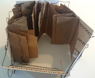
From my very initial little experiments I felt that it would make for a more interesting piece if I moved away from a more traditional folder style and perhaps made a more rounded book type structure. Based on my learning from the last chapter on how to attach pages effectively I produced a prototype to test my idea.
The photos below show this prototype both secured and sealed with a ribbon and how it looks unraveled. I particularly like the 'swirl' effect that the papers give when it is all rolled up as the effect reminds me a lot of the churning water at the back of the cruise boat when sailing. It is also a little reminiscent of some of the 'circular' motifs I came across when photographing text on the boat for example the compass.
I still have another concept to explore further before deciding but I am intrigued to how the idea below could would when combined with the embroidery techniques and my hand crafted papers. I could also bring in elements from previous modules to create a unique ribbon wrap to secure it all together.
 |
| 4/11/3a |
 |
| 4/11/3b |
 |
| 4/11/3c |
 |
| 4/11/3d |
 |
| 4/11/3e |
Thursday, 28 May 2015
Module 4, chapter 11: some very initial thoughts
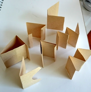
Just progressing along from the previous chapter (creating book-like structures) I started to consider some of the formats a 'backing' structure could have before pages were attached to it. The photos below show my very initial thoughts.
I was not particularly satisfied with these however as they were on the whole dull and predictable. This led me to start considering non-traditional shapes and structures- taking more of a 3D approach. The following images showcase some of my initial thoughts for these. I felt that these were more exciting shapes and had more potential for a more interesting final piece that the first batch I had produced. I particularly liked the concept of having a rounded structure. The other thought not far from my mind at this stage is the possibility of building more on the structure I had created in the previous chapter that can be seen in image 4/10/14.
 |
| 4/11/1a |
 |
| 4/11/1b |
 |
| 4/11/2a |
 |
| 4/11/2b |
Subscribe to:
Comments (Atom)


