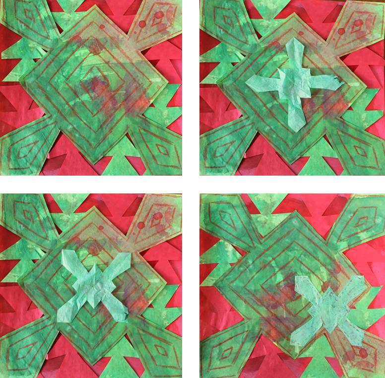
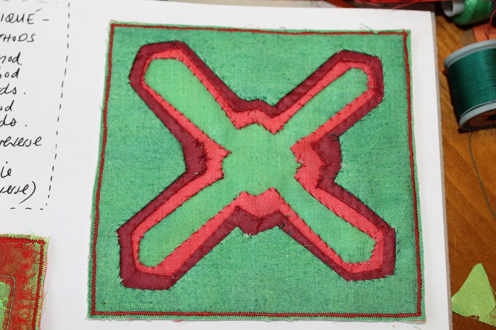
Sunday, 23 September 2012

Module one, chapter twelve.

For this Chapter I was required to study three artists:


  1. Herta Puls
  2. Kandinsky
  3. Someone of my own choice:
I decided to investigate the work of the Textiles and Fashion designer Zandra Rhodes.


I have always been a fan of the work of Zandra Rhodes and knew that among her vast catalogue of print designs she had produced patterns that used star motifs.

By chance, as I was investigating her further, I came across a book cover design that from a distance looked like a cross pattern. This meant that my study of her actually ticked two out of the three options to focus on!

For my studies I mainly used the internet to research these artists/designers however I was also lucky enough to already have access to a copy of Herta Puls book 'The Art of Cutwork and Applique' which gave me a great starting point to finding out what Mola embroidery was all about.

The most interesting thing about conducting these studies was that I wished I had investigated these artists at the start of the project rather than at the end of it as the module exercises directed me to. I feel that if I had looked at the ideas the work of these artists have given me as I was researching and developing my own thoughts that I might have taken influence from them and incorporated this inspiration in my own work. For example, I might have made more of the contouring aspects of the cut away applique that the Mola embroidery has to offer or I might have applied more consideration to the layout of my resolved sample so that it was more in a Kandinsky style. That said I can maybe use these influences in future modules and I will certainly be more aware of the potential for ideas that other artists and designers can offer when looking for inspiration when researching for future projects.


Please see below for my response to the studies.


Katie Green, module one, chapter twelve, image one
1/12/1: Study of Herta Puls and Mola embroidery


Katie Green, module one, chapter twelve, image two
1/12/2: Study of Kandinsky


Katie Green, module one, chapter twelve, image three
1/12/3: Study of my chosen artist: Zandra Rhodes


Saturday, 22 September 2012

Module one, chapter eleven

Chapter Eleven:
Resolved sample - Growth and disintegration


First thoughts: Paper experiments

The following images show my experiments with paper to try out a variety of ways of disintegrating the sheets leading to different effects and levels of this disintegration.


Katie Green, module one, chapter eleven, image one
1/11/1: Paper experiments sheet one
Katie Green, module one, chapter eleven, image two
1/11/2: Paper experiments sheet two

Second thoughts: Paper shapes

Not surprisingly, the more I cut the shape the trickier it became to reassemble! The colour of the background helped break up the shape giving the illusion of disintegration.


Katie Green, module one, chapter eleven, image three
1/11/3: Paper shapes

Third Thoughts: disintegrating fabric squares

The following two images show the completion of various exercises to disintegrate a piece of fabric. The main technique used was to fray the fabric however this very quickly left me with numb fingers! I soon found an alternative and quicker way to do this with a small pair of embroidery scissors.

Katie Green, module one, chapter eleven, image four
1/11/4: fabric disintegration experiments sheet one
Katie Green, module one, chapter eleven, image five
1/11/5: fabric disintegration experiments sheet two

Different ways of making a shape disintegrate/grow using stitchery

The first set of samples (left column in the following image) show my attempt at making one of my shapes thinner/smaller through reverse applique and contour stitching. The second set of images show my experiments with various forms of stitching to break up the green motif so that it has the optical illusion of disintegrating into the red background fabric.

Katie Green, module one, chapter eleven, image six
1/11/6: samples to play with growth and disintegration effects

Growth through repeat

Katie Green, module one, chapter eleven, image seven
1/11/7: Making shape from several smaller shapes
Katie Green, module one, chapter eleven, image eight
1/11/8: Shape repeated on a larger scale
Katie Green, module one, chapter eleven, image nine
1/11/9: Shape repeated into a half drop pattern
Katie Green, module one, chapter eleven, image ten
1/11/10: Scale change repeat
Katie Green, module one, chapter eleven, image eleven
1/11/11: Shape repeated to form another star (note incidental star in negative space)
Katie Green, module one, chapter eleven, image twelve
1/11/12: Overlapped repeat to form asymmetric star
Katie Green, module one, chapter eleven, image thirteen
1/11/13: Small scale repeated over large version of motif to form a new star shape

Planning the resolved sample

The following image shows the working sheet to collate together the ideas for the motif, colours and materials.

Katie Green, module one, chapter eleven, image fourteen
1/11/14: Planning the resolved sample in terms of motif, colour and materials

The following images show possible layouts for the resolved sample using coloured papers.

Katie Green, module one, chapter eleven, image fifteen
1/11/15: Planning layout #A

Katie Green, Module one, chapter eleven, image sixteen
1/11/16: Planning the layout #B

Katie Green, Module one, chapter eleven, image seventeen
1/11/17: Formulating the background on the resolved sample. Note addition of stitching (right)

The resolved sample

Once the background of felt bonded fabrics cut to shape was fixed in place with Bondaweb, the next stage was to create the main centre motif. Shiny green fabric was printed using the original stamp into a pattern that reflected the original motif that had been developed. A layer of printed net (printed in a different pattern to add contrast) was placed over. A layer of red satin was put underneath all these layers with several layers of chiffon and organza under that. Reverse applique was used using machine embroidery (satin stitch and a machine cross stitch pattern). This embroidery followed the original shape inside and out to give a feeling of growth. The print and netting at this stage giving an impression of disintegration. The chenille cut away applique method was used for the organza/chiffon layers and deliberately frayed for further effect. Note that on the actual sample this appears very textured but the photo does not do this justice unfortunately. A small version of the motif was then cut from a decorative bonded felt and then stitched in place using the cross stitch. This was applied so that the stitching went onto the layers underneath as well as on the bonded fabric to try and break up the outline and blend the shape into the background.

This was all that I had planned to do with the sample but I wasn't satisfied as the green motif just contrasted to much with the red. To combat this I then added a fibre paper shape and appliqued it on with a simple hand embroidered running stitch. This was a very subtle addition but it went a long way to 'kill' the overpowering green. This was challenging to sew on as by that stage there were numerous layers to penetrate the needle through. The top image that follows shows what the sample looked like before this final addition. The bottom image shows the finished resolved sample for this module.

Katie Green, Module one, chapter eleven, image eighteen
1/11/18: Resolved sample before final embellishment added 


Katie Green, Module one, chapter eleven, image nineteen
1/11/19: Resolved sample

Module one, Composite sheet

Consolidation of ideas....

The following image summarises for me the key research and samples that have inspired me the most as I have progressed from chapter one through to ten. The purpose of this sheet was to help inform my final resolved sample.

1/CS/1: Composite sheet to consolidate ideas so far.

Module one, chapter ten

To get started with this topic on Inlay Applique I first created an insertion stitch sample from a decorated felt bonded fabric cut up and reconstructed to test a variety of hand and machine embroidery stitches. The photo below shows the results of this along with my accompanying sketch book notes. I found the plaited insertion stitch the most challenging as there seemed to be very little in any of my embroidery books or online that showed you visually how to work it in a clear to follow way. The hand embroidery stitch that I enjoyed the most was the laced insertion stitch as although it was not the quickest nor the easiest one to complete it was the most therapeutic! I found that the hand embroidery stitches tended to look best when there was a visible gap between the fabric pieces while the machine stitches naturally pulled the fabrics together.


Katie Green, module one, chapter ten, image one
1/10/1, Insertion stitch sample

The following photo shows my first interchange sample at the top: 'simple counter-change sample 1'. For this sample I used two different bonded felt fabrics (that contrasted with each other) and used the laced insertion stitch to combine them together with the star motif cut and swapped between them. The outside edges have been finished with blanket stitch.

The sample displayed underneath is my counter-change sample 2. This is similar to the first sample however uses four different samples counter-changed between themselves with the motif in the centre. This sample also features an additional mini counter-change in the middle. Once again the fabrics have been joined using the laced insertion stitch but the motif has been joined using a 'cross' machine stitch. Before starting this sample I planned this idea out carefully by trying out the various possible combinations first. The photo that follows shows my working sheet for this along with the planning for interchange sample 3.


Katie Green, module one, chapter ten, image two
1/10/2: Counter-change samples 1 and 2


Katie Green, module one, chapter ten, image three
1/10/3: Working sheet for interchange samples 2 and 3

My final interchange sample shows four different squares of decorative bonded felt fabrics. As you can see from my working sheet I decided to rotate the designs to add another dimension of interest. This time as well as the motifs the squares were attached using the cross machine stitch and further embellishments were made with hand embroidery afterwards. I was very pleased with the overall effect- it is interesting that the sample looks far more complex than it was to produce. I feel that part of the success of the sample however was down to the various contrasts in textures and colours.


Katie Green, module one, chapter ten, image four
1/10/4: Interchange sample 3

Friday, 24 August 2012

Module one, chapter nine

An exploration of different reverse applique techniques.

Sample one: Traditional reverse applique

I did not enjoy this technique so much, maybe because I produced this sample when I was ill, maybe because the shape I chose to use wasn't as effective as I hoped it would be!

Katie Green, module one, chapter nine, image one
1/9/1: sample one, traditional reverse applique
Samples two and three: Contemporary reverse applique samples.

For these and the other samples I chose to switch to another shape as I felt the one that I chose for sample one was not quite right for the effects I wanted to create. The shape I went with however did retain an essence of the shape in sample one so all samples do still feel like they are part of the same collection.

Sample two (left)= outside in, sample three (right) = inside out. Both use the same fabric layers to start with. Sample two gives a great sense of depth whereas sample three protrudes outwards. It is amazing how the same layers, colours and shapes can be so different depending on the order of cutting!

Katie Green, module one, chapter nine, image two
1/9/2: samples two and three, contemporary reverse applique
Sample four is of chenille / slashed reverse applique.

Until this course I had not heard of this method but it has now become one of my favourite techniques ever! I love the textured effect it gives and I can see all sorts of future possibilities with my work if I was to do this technique again. It is a real shame that I have been unable to take a photo that really does this sample any justice as the texture that makes it work appears to be bleached out somewhat, although interesting to note that the print on the top layer of fabric is more obvious on the picture than it is on the actual sample.

Katie Green, module one, chapter nine, image three
1/9/3: sample four, chenille / slashed applique

Sample five is a multi-coloured ripple effect reverse applique.

This sample appears to have the best of both worlds of depth and 3D effects that were seen in samples two and three. I was quite experimental here and layed out the colours in a random way before sewing. To develop this kind of sample further more could be done to plan out what colour goes where in advance. It would also be interesting to try out this technique with other stitches such as satin stitch or a decorative machine stitch- I will bear this in mind if I chose to use this sample on my resolved piece.


Katie Green, module one, chapter nine, image four
1/9/4:sample five, multi-coloured ripple effect reverse applique

Module one, Chapter Eight

This chapter demanded more complex samples using padding and stitching instead of fabric. I identified that in order to make this work I would need to map out each of the layers in advance: the image below shows this planning alongside a small thumbnail image of the final samples.


Katie Green, module one, chapter eight, image one
1/8/1: Planning the layers
The following images show my final six samples. I found that the padding adding some interesting three-dimensional effects that I have been unable to showcase as effectively in photographing them. Sample five is a good example where the picture does not do the padding justice. My favourite sample was number two- I loved the way the minimal contrast actually lended more interest to the design with the subtle differences in the shades of red used. This also gave more emphasis to the padded middle which has been highlighted with the only colour contrast in green thread. Sample six: if I was to do this one again I would probably take the 'less is more' approach as I feel that the colour combinations along with the layer combinations are overkill and that the printing distracts from the main shapes (whereas I personally feel the printing complements the design in sample three) . Maybe this one would have worked better if I had stuck with red on red like I did with sample two.

Once again please note that my images appear faded in contrast with the actual colours of the samples. I have tried taking more photos but cannot seem to get the colour balance to reflect real life.


Katie Green, module one, chapter eight, image two
1/8/2: sample one


Katie Green, module one, chapter eight, image three
1/8/3: sample two
Katie Green, module one, chapter eight, image four
1/8/4: sample three
Katie Green, module one, chapter eight, image five
1/8/5: sample four
Katie Green, module one, chapter eight, image six
1/8/6: sample five
Katie Green, module one, chapter eight, image seven
1/8/7: sample six

Module one, Chapter seven

To start this chapter, which is all about translating layered designs into embroidery, I produced a stitch sampler featuring a mixture of hand a machine embroidery. Seeing the stitches presented in this way was very useful later on when deciding on the most appropriate approach for my chapter main samples. I am lucky to have a sewing machine that has a wide variety of stitch selections but I resisted temptation in trying all of them and just chose to try ones that I thought might work well if used with the shapes I was starting to develop.


Katie Green, module one, chapter seven, image one
1/7/1: Stitch sampler
The next stage was to carefully plan ahead for the samples I wished to create. Up to this stage I had produced a wide variety of shapes, colour combinations and textures so it was important to think carefully about what had worked well for me so far in order to generate a successful sample. The following image shows my planning process including the documenting of each layer as I produced each sample.


Katie Green, module one, chapter seven, image two
1/7/2: Planning the samples
The following image presents my six samples for this chapter. The shape in the fourth sample has been repeated twice in sample five and three times in sample six. I found it fascinating how the sample shape could look so different when presented like this, especially when produced with different colour combinations. My personal favourite sample is the third one as I like the way the bonded fabric contrasts with the sheer green chiffon on top and the dark red underneath to create an illusion of depth that the other samples do not quite have. My least favourite sample is the first one as I think my hand embroidery stitches distract from rather than harmonise or accentuate the shapes. In the samples where I used the machine embroidery I was particularly taken with the fact the machine embroidery softens the edges, maybe this is an effect that I can play on more later on with the resolved sample. Please note that for some reason the photos appear slightly 'faded' in contrast with the actual samples which are much bolder and more vibrant in colour. Also to note that after the photos were taken the edges were neatened off more for a more polished finish.

Katie Green, module one, chapter seven, image three
1/7/3: sample one
Katie Green, module one, chapter seven, image four
1/7/4: sample two
Katie Green, module one, chapter seven, image five
1/7/5: sample three
Katie Green, module one, chapter seven, image six
1/7/6: sample four
Katie Green, module one, chapter seven, image six
1/7/6: sample five
Katie Green, module one, chapter seven, image seven
1/7/7: sample six