Friday, 24 August 2012

Module one, Chapter Eight

This chapter demanded more complex samples using padding and stitching instead of fabric. I identified that in order to make this work I would need to map out each of the layers in advance: the image below shows this planning alongside a small thumbnail image of the final samples.


Katie Green, module one, chapter eight, image one
1/8/1: Planning the layers
The following images show my final six samples. I found that the padding adding some interesting three-dimensional effects that I have been unable to showcase as effectively in photographing them. Sample five is a good example where the picture does not do the padding justice. My favourite sample was number two- I loved the way the minimal contrast actually lended more interest to the design with the subtle differences in the shades of red used. This also gave more emphasis to the padded middle which has been highlighted with the only colour contrast in green thread. Sample six: if I was to do this one again I would probably take the 'less is more' approach as I feel that the colour combinations along with the layer combinations are overkill and that the printing distracts from the main shapes (whereas I personally feel the printing complements the design in sample three) . Maybe this one would have worked better if I had stuck with red on red like I did with sample two.

Once again please note that my images appear faded in contrast with the actual colours of the samples. I have tried taking more photos but cannot seem to get the colour balance to reflect real life.


Katie Green, module one, chapter eight, image two
1/8/2: sample one


Katie Green, module one, chapter eight, image three
1/8/3: sample two
Katie Green, module one, chapter eight, image four
1/8/4: sample three
Katie Green, module one, chapter eight, image five
1/8/5: sample four
Katie Green, module one, chapter eight, image six
1/8/6: sample five
Katie Green, module one, chapter eight, image seven
1/8/7: sample six

Module one, Chapter seven

To start this chapter, which is all about translating layered designs into embroidery, I produced a stitch sampler featuring a mixture of hand a machine embroidery. Seeing the stitches presented in this way was very useful later on when deciding on the most appropriate approach for my chapter main samples. I am lucky to have a sewing machine that has a wide variety of stitch selections but I resisted temptation in trying all of them and just chose to try ones that I thought might work well if used with the shapes I was starting to develop.


Katie Green, module one, chapter seven, image one
1/7/1: Stitch sampler
The next stage was to carefully plan ahead for the samples I wished to create. Up to this stage I had produced a wide variety of shapes, colour combinations and textures so it was important to think carefully about what had worked well for me so far in order to generate a successful sample. The following image shows my planning process including the documenting of each layer as I produced each sample.


Katie Green, module one, chapter seven, image two
1/7/2: Planning the samples
The following image presents my six samples for this chapter. The shape in the fourth sample has been repeated twice in sample five and three times in sample six. I found it fascinating how the sample shape could look so different when presented like this, especially when produced with different colour combinations. My personal favourite sample is the third one as I like the way the bonded fabric contrasts with the sheer green chiffon on top and the dark red underneath to create an illusion of depth that the other samples do not quite have. My least favourite sample is the first one as I think my hand embroidery stitches distract from rather than harmonise or accentuate the shapes. In the samples where I used the machine embroidery I was particularly taken with the fact the machine embroidery softens the edges, maybe this is an effect that I can play on more later on with the resolved sample. Please note that for some reason the photos appear slightly 'faded' in contrast with the actual samples which are much bolder and more vibrant in colour. Also to note that after the photos were taken the edges were neatened off more for a more polished finish.

Katie Green, module one, chapter seven, image three
1/7/3: sample one
Katie Green, module one, chapter seven, image four
1/7/4: sample two
Katie Green, module one, chapter seven, image five
1/7/5: sample three
Katie Green, module one, chapter seven, image six
1/7/6: sample four
Katie Green, module one, chapter seven, image six
1/7/6: sample five
Katie Green, module one, chapter seven, image seven
1/7/7: sample six

Monday, 25 June 2012

Module one, chapter six

The first 6 samples in this chapter were fabric versions of the coloured cut paper layered designs in chapter 4. I used a mix of fabric types for these- the thick with the thin, the opaque with the semi-transparent. I also utilised some of my printed fabrics from chapter 5 to add another level of detail. When using the netting/organza/chiffon I experiemented with trapping threads and other bits such as fruit netting and slivers of cellophane sweet wrappers underneath the Bondaweb.

The second set of 6 samples I experimented further with the trapping of threads and netting etc and seeing how they looked on different backgrounds. I also experimented with painting the surface of the Bondaweb. Unfortunately I found that this technique did not adhere to the background as well as I hoped however it did give quite a nice 'distressed' look because of this. For all these samples I made the point of using just one layer and design 'A5' from chapter 4. I felt that by using the same pattern for each it would make it easier to compare and contrast each sample. I also made the point of trying all colour combinations: red on red, green on green, green on red and red on green. I prefer the samples that have the contrasting colours.

Katie Green, Module 1, chapter 6, image 1
1/6/1: Bondaweb experiments
For my next batch of 6 samples I tried using some of my dyed tissue paper bonded to a fabric background. To add interest I scrumpled it up first, however I found that the process of ironing the Bondaweb to it flattened it out too much. In the other samples I was more experimental with the way I layered the trapped threads and other components underneath. I decided I preferred the more random effects to the samples where I carefully placed the threads into specific lines. Once again for all these samples I used the cut paper pattern 'A5' from chapter 4 in a single layer.

I have also included off-cuts and other samples of trapped threads/netting and other components using Bondaweb and netting/fibre paper on top.

Katie Green, Module 1, chapter 6, image 2
1/6/2: Further Bondaweb experiments
Finally, below are the larger samples that I produced ready to work with in chapters that follow. Each sample is 20x20cm in size. For some reason the photograph does not reflect the vibrant colours of the actual samples I produced nor can you appreciate the details of the threads etc trapped under the top layers that you can if you handle the actual samples.


Katie Green, Module 1, chapter 6, image 3
1/6/3: Larger Bondaweb 'trapped' samples ready for use as layers in other samples

Module one, chapter Five

For my fabric selections I raided my own existing stash of fabrics and found some other fabrics in the recycling/scraps box in my classroom at school where I work. This meant that I did not need to purchase any fabrics but I still ended up with a good selection to draw upon. I did however buy some fibre papers (one in green, one in red) as I thought that these would contrast well with the other fabrics that I already had. The range of fabrics that I collected included plain cottons, polyester lining fabric, faux suede, faux silk, netting, organza, chiffon, felt and satin. There were a few other fabrics too although I only had very small quantities of them. Some of the fabrics I had I dyed green to see how they would look. This had varying effects, the same dye came out in different strengths depending on the type of fabric it was used on. I decided not to pursue this idea beyond the small samples I tested as it was a bit hit and miss for my colour scheme and was also time consuming.

After collecting the fabrics I then experimented with printing onto them taking into consideration the patterns that I felt worked well when previously using my printed stamp onto my coloured papers.

Below are images that show my fabrics in swatches and some test prints I tried. I did create other prints but these were used in some of the samples in chapter 6.

Katie Green, Module 1, chapter 5, image 1
1/5/1: Printed experiments onto my selected fabrics

Katie Green, Module 1, chapter 5, image 2
1/5/2: Swatches of collected fabrics and some further printing experiments

Below are some of the larger pieces of fabric that I printed ready for samples to be used in later chapters for this module. The more faded samples show the print onto a light green netting. As they were placed over a white piece of paper for the photo they look really pale in the photo but in real life they are actually quite vibrant! I really liked the effect this gave and it gives opportunities for layering later on.

Katie Green, Module 1, chapter 5, image 3
1/5/3: Larger printed samples ready for use later in the project

Module one, chapter four


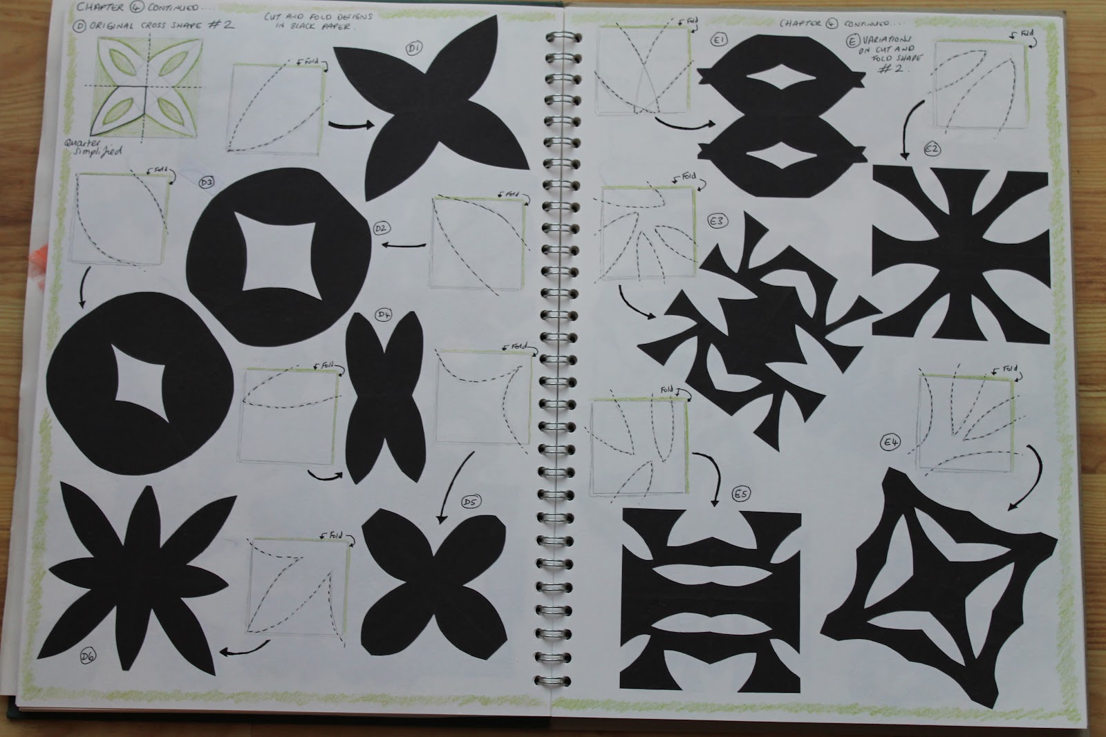
Katie Green, Module 1, Chapter 4, Image 1
1/4/1: Cut and fold designs in black paper
I got slightly carried away with this chapter, I really enjoyed seeing all the different patterns I could create. Even still, I dont even think I managed to even scratch the surface of all that is possible!

I found that the corner folded designs seemed to give more interesting effects. The only downside to this is that they were more difficult to cut out the more that they were folded.

For my coloured layered designs I chose a variety of versions to layer up taking particular care to select designs that would show off the layers under them well. I really liked the depth that the contrasts in colour gave to the layers when combined.

Katie Green, Module 1, Chapter 4, Image 2
1/4/2: Cut and fold designs in black paper


Katie Green, Module 1, Chapter 4, image 3
1/4/3: Cut and fold designs in black paper


Katie Green, Module 1, Chapter 4, image 4
1/4/4: Cut and fold designs in coloured papers layered together


Module one, chapter three

For this chapter I produced 3 design sheets as can be seen in the images below. These designs took me quite a bit longer than I anticipated due to the complexity of the cutting of them more than anything else. I realised too after my initial batch of 'distortions' for design sheet A that I had misread the instructions so I had another go at them with very different results.

One of the things I found interesting was that I preferred collaging green onto red: This was a reverse of what I had preferred with the printing.


Katie Green, Module 1, Chapter 3, Image 1
1/3/1: Design sheet A
Katie Green, Module 1, Chapter 3, Image 2
1/3/2: Design sheet B
Katie Green, Module 1, Chapter 3, Image 3
1/3/3: Design sheet C

Module one, chapter two

For this chapter I first had to consider a possible colour scheme to work within from this point onwards. From my research I had come across two possibilities which I explored further before deciding on colour scheme idea #2 with the greens contrasting against the reds and rusts. This colour scheme had been specifically inspired by a tiny star shaped fitting I had found inside my patio door hinge. I rejected the other colour scheme idea as the colours did not contrast enough for my liking and the overall effect was a little too subtle. The following picture shows my notes from this exercise:

Katie Green, Module 1, Chapter 2, Image 1
1/2/1: Colour scheme explorations
After deciding on this colour scheme I wanted to explore how it would look with the photo that I had been inspired by for the alternative colour scheme: the close up on a glass paperweight crystal. I imported this image into 'Photoshop' and tried different variations of this. The result led me to develop my printing stamp which I then tested onto one of my inked backgrounds also created for this chapter.
Katie Green, Module 1, Chapter 2, Image 2
1/2/2: Pages showing my Photoshop experiments and my initial testing of my stamp print onto an inked background

Next I then tested out a range of different patterns and effects with the printing stamp onto more of my inked backgrounds. I found using red onto green or blended colour backgrounds to have the best effect. I did try a green print but this did not look so good as it tended to blend too much into the background.

Katie Green, Module 1, Chapter 2, Image 3
1/2/3: Further experiments with printing stamp onto coloured inked backgrounds
Katie Green, Module 1, Chapter 2, Image 4
1/2/4: Further printing experiments and collaged shapes using the printed papers.

Finally (see image above) I tested out a range of shapes using paper collage from my inked papers. These shapes were all inspired by my research in chapter one.