Friday, 20 February 2015

Module 4, Chapter 5: Exercise 2: Displacing threads

Module 4, Chapter 5, Exercise 2, image 1
Module 4, Chapter 5, Exercise 2, image 1: All my samples together

Experimenting with colour:
For the most dramatic effect on the fabric I coloured onto samples black stripes in various patterns. I then pulled the threads to displace them rather than pull them out completely. The result was added interest and detail to my samples. I found it was the most effective when several strands were displaced in a block (or at least in twos) as only pulling one strand was a little too subtle. See images 2, 3 and 4 for close ups of some of these black stripe samples.

As gold is part of my colour scheme I went on to experiment with colouring the fabric with a gold marker pen before displacing threads. Unfortunately the gold did not stand out particularly well against the red. I then tried it against a black fabric but that did not work particularly well either so this idea was quickly abandoned.

The black fabric I used with the gold pen held my interest however as the warp was white and the weft black within the construction. I noticed that drawn thread work gave fantastic results because of this and I could play with pattern as a result. Pulling the white threads partially out gave a pleasing spotty effect to the fabric.

Finally with all the withdrawn threads I had collected I used these to weave and stitch back into some samples. These gave a range of interesting textures to the surface of the samples.See images 5 and 6 below.

Module 4, Chapter 5, Exercise 2, image 2
Module 4, Chapter 5, Exercise 2, image 2: Displacing threads
Module 4, Chapter 5, Exercise 2, image 3
Module 4, Chapter 5, Exercise 2, image 3: Displacing threads
Module 4, Chapter 5, Exercise 2, image 4
Module 4, Chapter 5, Exercise 2, image 4: Displacing threads
Module 4, Chapter 5, Exercise 2, image 5
Module 4, Chapter 5, Exercise 2, image 5: Reintroducing removed threads
Module 4, Chapter 5, Exercise 2, image 6
Module 4, Chapter 5, Exercise 2, image 6: Reintroducing removed threads

Module 4, Chapter 5: Exercise 1: Drawn thread work

Initially I found the whole process of removing threads to be both fiddly and time consuming. Over time I developed my own technique and rythymn to it meaning it became a little easier and quicker for me. The use of a needle and quick unpick seemed to work as tools for me.

I created a number of mini samples using quite a fine lightweight fabric in my red accent colour. See below. The fineness of this fabric meant that I had to really concentrate when removing threads. Let's just say a number of samples initially went so wrong they ended up in the bin. I do not have any pictures of these but they ranged from disintegrated samples that were pretty much nothing more than piles of threads to samples that were littered with unintentional and unattractive holes in them. It was quite evident early on that the more threads that were removed the more delicate the sample became. This is definitely something to be considered in future samples.

Module 4, chapter 5, exercise 1
Module 4, chapter 5, exercise 1: Drawn thread work

Module 4, Chapter 4: Paper making leading to colour scheme

The first time I had ever attempted paper-making was when I did my A levels at school. This previous knowledge helped me to get started with this chapter. I already had an old wooden frame that I was able to cover with fabric netting. This seemed to work quite well in the process. 

My favourite paper experiments came from mixing in a little metallic paper- these elements gave flecks of sparkle to my papers and linked back well to the metallic envelopes I had collected in my media research. This sparkle also represented to me the glitz of the cruise ship so seemed to be quite fitting to my theme. Another element that was successful for me was the addition of strands of silk waste in my accent colour of red. I also had gold threads that were also used for metallic touches within the paper. I found that by adding these threads gave a strength to the papers I created.

Although I love the natural beige/brown colours created by the materials I was using to create my papers and had added colour to these through embedding threads and netting, I decided to add some colour with red tissue paper and other red papers. The result of this was more of a pink effect. I was not too disappointed with this however as the pink related well to some of the stamps i had collected and there were plenty of pink shades and tones within my cruise photos to link with this too.

An element of the paper making that was not as successful for me was trying to emboss it or to create 3D elements to it. These took a long time to dry and on some pieces made the paper quite brittle.

Once I had made my papers I collated examples together along with other media pieces such as stamps to create my colour board (see below). My colour scheme was thus decided to be beige, brown, black, white, red, pink, silver and gold. This sounds like quite a long list, however tonally I feel they work together well and it visually looks to be quite a simple scheme in my opinion.

Module 4, Chapter 4, Image 1
Module 4, Chapter 4, Image 1: Paper-making and colour scheme

Module 4, Chapter 3: Grids

For Chapter 3 I spent time collecting a range of 'grid' like fabrics. To source appropriate materials I raided my home stash bag plus was able to find suitable fabrics in the fabric scraps box at school. Interestingly students always ignore fabrics such as these so most of the ones I found were literally at the bottom of the box. The image below shows a 'summary' of the fabrics I discovered. I particularly like the fruit netting as a grid like fabric. The main reason for this was that I love the boldness of this colour against the more muted beige, browns and monotones of my media research and it was a notable accent colour that stood out to me when looking at my cruise photos of lettering.

Module 4, Chapter 3, Image 1
Module 4, Chapter 3, Image 1: Grid collection

Module 4, Chapter 2: Lettering designs

To start this chapter I first experimented with hand writing my chosen word 'cruise' (inspired by my holiday!) in a variety of different ways. I tried different pens, paintbrushes, and even created my own writing tools out of card scraps. I additionally wrote onto some alternative backgrounds taken from my media research such as envelopes. Although I was trying out all these variations I found it interesting that I could still detect my own handwriting style in them as a collection. The experiments that did not work for me was writing in wax with an ink resist and the writing in bleach. I think with hindsight both of these were down to the materials being old. They had been festering in my paintbox since the late 90s. I have since invested in some new ink!

Module 4 Chapter 2 image 1
Module 4 Chapter 2 image 1: Hand written lettering
Following on from hand written lettering I created ideas using CAD, in this instance Illustrator. Although I am an old hand with Photoshop I have rarely had need to use Illustrator so it took a while to become familiar enough with the tools to get started. Once I had though I found it was a very quick process to churn out possible ideas. I decided to keep with a very 'hand written' feel using my mouse to write the words. Illustrator then allowed me to repeat, mirror and distort the words in a number of ways in order to create new patterns from the word. One distortion I was drawn to was to make the letters appear as if they had been stitched by converting them into dashed lines. Below are examples of what I created however as this technique had endless possibilities they are by no means the only results of what I produced overall.

Module 4 Chapter 2 image 2
Module 4 Chapter 2 image 2: Patterns using the word cruise created using CAD
Module 4 Chapter 2 image 3
Module 4 Chapter 2 image 3: Patterns with word distorted into dashes to represent stitches


Thursday, 19 February 2015

Module 4 Chapter 1: Media research

The first collection of inspiration I gathered was of potential materials I could use in my project. I was particularly drawn to brown envelopes, the insides of window envelopes (black and white patterned papers) and postage stamps. To summarise this collection of resources I collated a selection together as follows:

Module 4 chapter 1 image 1
Module 4 chapter 1 image 1: Media research
Following on from my materials research I put together a collection of lettering styles for consideration. The only criteria I followed for this was that I was being personally drawn to specific styles. I did however try and find as wide a range of styles as possible from calligraphy to graffiti to Art Nouveau.

Module 4 chapter 1 image 2
Module 4 chapter 1 image 2: Lettering styles #1

Module 4 chapter 1 image 3
Module 4 chapter 1 image 3: lettering styles #2
After this research it was time for me to go on my Cruise holiday- a week away on the Royal Caribbean boat 'The Independence of the seas'. Not only did this cruise around the French and northern Spanish coats generate many memories through photos and newsletters among other keepsakes (as I had anticipated in this module's introduction) I found inspiration all around me. All around the boat there were examples of different lettering styles all presented in different formats. I took numerous photos to record all of these- the following images displaying the ones that appealed to me the most:

Module 4 Chapter 1 image 4
Module 4 Chapter 1 image 4: Images of lettering from cruise

Module 4 Chapter 1 image 5
Module 4 Chapter 1 image 5: Images of lettering from cruise

Module 4 Chapter 1 image 6
Module 4 Chapter 1 image 6: Images of lettering from cruise

Module 4 Chapter 1 image 7
Module 4 Chapter 1 image 7: Images of lettering from cruise

On return from the cruise I investigated how others had written the word 'cruise' in different lettering styles. I was a little surprised to see that many were actually quite simple in style. I particularly liked the ones that had a hand written feel to them. 

Module 4 Chapter 1 image 8
Module 4 Chapter 1 image 8: Cruise lettering

Module 4 Introduction

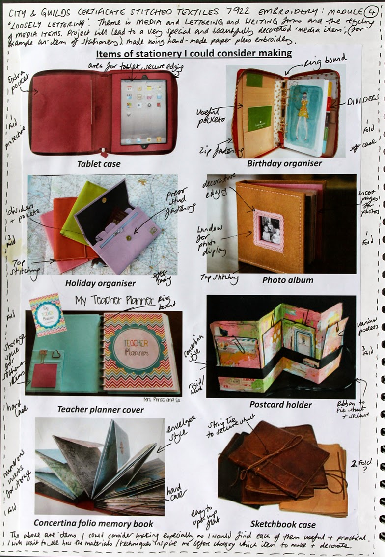
Module 4 is titled 'Loosely Lettering' with the themes of media, lettering, writing forms and the recycling of media items. This project will lead to a very special and (hopefully!) beautifully decorated 'media item'. This could be for example an item of stationery and will be made using hand made paper plus embroidery.

To start this module I investigated some possible end outcome ideas (see below). As a teacher I felt that an item linked to planning or organising would be useful. I was also interested in the idea of producing some kind of memory store for a cruise I was about to embark on and I feel that many of the items I researched would fulfill this requirement.

Module 4 Intro Image 1
Module 4 Intro Image 1: Items of stationery I could consider making